News & Media / Podcast / The New Look
The New Look
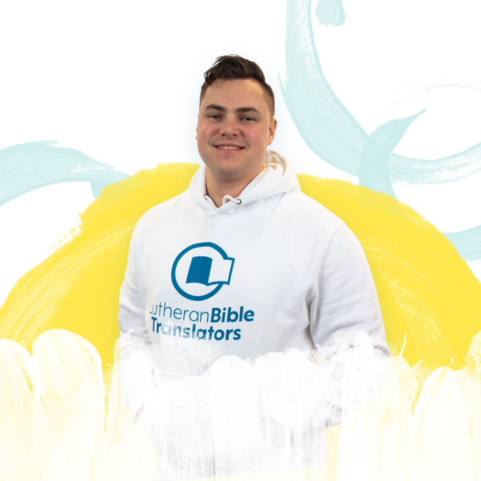
Caleb Rodewald
About The Episode
Keeping with tradition and updating for the next innovative period in the Bible translation movement.
Millions of people remain in the dark as to what God’s Word actually says. Hope is found in the light of Scripture when it is accessed in a language that they understand best. Lutheran Bible Translators’ new logo shows that movement from darkness to light, through the Word and into the world.
Listen in as Creative Lead Caleb Rodewald unpacks the new look of Lutheran Bible Translators.
00:01
Caleb Rodewald
And this beautiful story started to emerge through the process of God’s word from darkness into light, through the word into the world.
00:18
Rich Rudowske
Welcome to the essentially translatable podcast brought to you by Lutheran Bible translators. I’m Rich Rudowski.
00:24
Emily Wilson
And I’m Emily Wilson.
00:25
Rich Rudowske
And we are here today to talk about our new year. New you look here at Lupin Bible translators and some of the background behind logo design, branding, both our own and just in general. What are some of the thoughts you have when you look at your branding?
00:43
Emily Wilson
Yeah. So we do hope that you have noticed that there is a new look.
00:47
Rich Rudowske
That’s right.
00:47
Emily Wilson
Yeah. Just to be able to dive in a little bit further and see what goes behind the process of rebranding and having a new logo. And so we’re talking with creative lead Caleb Rotewalls today. So before the episode, before we jump in, though, just wanting to encourage you to subscribe to essentially translatable. That’s how you can stay up to date on all that’s happening, especially with more than words, the comprehensive campaign for scripture impact and how to hear stories from around the world. So I want to encourage you to subscribe on iHeartRadio, Apple Podcasts, Google Podcasts, Audible, the like.
01:35
Rich Rudowske
Yeah. And any of those platforms where you may already be getting music or other podcast content. Another thing you can do from those is share. And so find that way that you share from that platform. And if you like the content you hear here or on any of the over 70 episodes now in our inventory.
01:52
Emily Wilson
Yes.
01:52
Rich Rudowske
Please share that content with somebody else that you think needs to hear. It needs to be encouraged and share some of what you’re excited about as you’ve been listening to some of the episodes of essentially translatable. All right, we are here in the studio today with Caleb Rotelwald, who serves as the creative lead for Lutheran Bible translators. He has been on our staff since 2019, that prehistoric era before COVID and been affiliated or associated with the organization even longer than that. That’s part of the story. So we want to say welcome, Caleb.
02:24
Emily Wilson
Welcome to the podcast.
02:25
Caleb Rodewald
Thank you very much. Longtime fan, first time guest.
02:29
Emily Wilson
I was going to say you kind of snuck in the April Fool’s episode as a right substitute host.
02:37
Rich Rudowske
Yeah, we always knew that.
02:39
Caleb Rodewald
Was that the monster.
02:40
Rich Rudowske
Monster truck.
02:41
Caleb Rodewald
Monster truck, yeah.
02:43
Emily Wilson
So you have really had a long history with the organization. And can you share a little bit with the listeners of how you have known Lutheran Bible translators through the years?
02:54
Caleb Rodewald
Yeah. Well, I am a missionary kid, and as a missionary kid, my parents decided that they wanted to do Bible translation, which is this very important life saving mission. And they decided they also wanted kids out on the field. I am part of that. I have two brothers who were also born overseas in this mission. In a lot of ways, we didn’t really know what was going on, but we got to see a lot of the changes and people in the communities. And so, yeah, that was all with Lutheran Bible translators. In fact, most of our lives, I guess I should mention, my father is Dr. Mike Rotewald, the CEO emeritus.
03:36
Rich Rudowske
Sure. I think that’s what we call him now.
03:38
Caleb Rodewald
Is that how we do it? Sounds fancy.
03:41
Rich Rudowske
It does. Latin.
03:42
Caleb Rodewald
Yeah, Latin always does that. And so I am pretty familiar with this mission and especially Lutheran Bible translators and what it does and kind of the look and feel of it all the way from me being born, you could say, over time, went away, off to college, didn’t my own stuff, doing like art, creative design, and went off into a different sphere and eventually made it back into the mission after telling my dad I’d never be a missionary. Somehow God just is like, well, maybe not directly.
04:19
Emily Wilson
So growing up in Botswana and southern Africa, you had the opportunity to live and see partnerships unfold. And that’s really played in with your understanding of design materials and just also the importance of being able to convey the ministry well in a larger sphere. And as you mentioned, you have a graphic design trained background in illustration, and you really have conveyed over the years of not only being the executive director son, but also the graphic designer, an opportunity over the years to provide a consulting role as a contractor that the logo, the look of an organization is essential. It is not something to just bypass. So why is a refresh? As we’re looking at the CUsP 2023, we’re at the more than words comprehensive campaign for scripture impact. Why is that logo refresh so necessary?
05:20
Caleb Rodewald
When I was young, one of the things I always felt like was there was all these great companies and people and bands and they all had these great brands and it looked cool. It looks like somebody really cared about what they were making. And then I’d look at the church stuff and they’d have papyrus on their logos, which is just one of those. You don’t see it as much anymore. I think people have started to catch on that don’t use certain fonts, but back in the day, papyrus. It looks like a cool font. Even avatar that the movie used, it.
05:55
Rich Rudowske
Was cutting edge at some point.
05:56
Caleb Rodewald
Cutting edge at some point. But yeah, so I would look around and I’d see stuff like that and be like, well, why can’t the church, or even church organizations like Lutheran Bible translators have good design and good outreach that can speak especially to an american audience? You get into a lot of different things when you’re trying to go cross cultural with your design work like that, but especially to an american audience. And what is cutting edge, how do you stand out but also not look bad? A lot of times it’s someone who’s been asked to do it because they have the time to do it, not so much if someone’s asked to do it because that’s their passion and that gets really difficult.
06:48
Caleb Rodewald
Yeah, I kind of want to just talk about branding and kind of design and a look and feel of an organization or just how important that can be to show yourselves to other people.
07:02
Rich Rudowske
So even as a kid or young man, you felt like you kind of zeroed in on brands and would be really interested in that. I don’t think that everybody’s like that. People are probably more subconsciously affected by brand, but it was more of a conscious thing for you. And what kinds of things sort of drew your attention that you found more interesting?
07:23
Caleb Rodewald
Well, so it was mostly when I was younger is books and a lot of good book cover designs, books on dragons when you were a kid. But a lot of these books have really great cover designs that really try to sell you on the idea of what’s inside, get you excited about what you’re going to open up and find. Even great paperback books, like Stephen King’s paperback books that you find there, like these really fun covers with these fonts that are really spiky and like, ooh, this is going to be horror. Get into this stuff like that. And I would see that, which would make me excited to open these books and really get down to it. And I’m also an illustrator, so draw things from it. And so then there would also be brands, which would make me really excited.
08:12
Caleb Rodewald
The epitome apple, like, where it’s just the logo of an apple, but it’s like, really excited. Oh, it’s just an apple, but you know what that means. And whenever you see that apple logo, you think of these really polished surfaces. So I saw a lot of these things, but yes, mostly books. And then I would look at the church or a church bulletin or something, and I would look at it. I’m like, I don’t want to open this up. Not because of what was inside, but because just the front covers would not be exciting, which is the wrong way to look at scripture and stuff like that, but it’s just kind of how my brain works. And looking at a cover of something, I really want to be excited to get into something. So that was my first thing.
09:00
Caleb Rodewald
And I really tackled a lot of it more when I was younger as more illustration pieces and what the picture of the dragon I thought would make me excited. But as I got older and started looking at it was really the fonts and the little images and the way those images and fonts would work together to get your eye to move around the front cover of a book. But yeah, so jumping right to logos, especially in a brand, because brand goes really far. There’s a whole lot of stuff there. But we can focus in on logos. And logos really is more, you can see it as like a symbol of a company or a organization, and this symbol becomes like encompassing of what this company is.
09:47
Caleb Rodewald
And so again, going back to Apple, you just get this really sleek design and, oh, I’m going to get some quality there, hopefully. So when you look at the LBT logo over the years, well, we can go even further back to when they were called Messengers of Christ, which is before my lifetime, I think.
10:10
Rich Rudowske
Actually all of our lifetimes, before all of this. It’s been a while, but yeah, the branding there was a certain thing and communicates a certain thing.
10:21
Caleb Rodewald
Yeah, communicates a certain thing. Of course, there’s also the timing of it. And really that brand, it was a shield and spear which really actually evoked the idea of the missionary going to parts unknown and understanding things and really focusing in on the missionary taking God’s word somewhere unknown to people who need to hear it, which I think actually worked. Over time, it kind of changed and eventually became this teal world logo with LBT in the center. The acronym LBT. Very interesting. It’s cool idea of this LBT with this outlined Bible in the world. And this is really where the brand changed to how we kind of talk about the brand now. But like the Bible being in the world, LBT, bringing that translation to the world kind of thing. I’m not saying it was the best design.
11:19
Caleb Rodewald
It kind of looks very eighty s and I’m not even sure if it came out in the think it did.
11:23
Rich Rudowske
And I think every logo I’ve seen, and we’ve had a few changes and I’ve been in Lutheran Bible translators 15 years, but the same elements were there as a globe, a book, and the letters LBT.
11:37
Caleb Rodewald
Yeah.
11:37
Rich Rudowske
And so those things were designed to communicate certain things.
11:43
Caleb Rodewald
Yeah, we’ve kind of kept that. After that it became this kind of stylized art, same thing with a book with LBT in it, with the earth, like the globe. And then it was flattened at one point so that it was just basically just like a vector image, a black, flat image of it. And whoever did that in those days forgot to get rid of the shadow of the earth there. That was me.
12:12
Rich Rudowske
Thus creating the fictional continent, lb Tinia. Yeah, that was a little insider thing there.
12:18
Caleb Rodewald
Yeah, that was when I was still in school and I had done an internship with LBT. I’m like, I can make this logo.
12:23
Rich Rudowske
Better just northeast of.
12:25
Caleb Rodewald
Yeah, yeah, a little weird there, but yeah, that got taken out. And then for a long time, that was kind of the logo here with various kind of uses of Lutheran Bible translators around that it had God’s word for every language, was part of the logo at one point, but, yeah, it remained that way for a long time until, well, when I came on board, I think one of the things I always asked about, hey, can we redesign this logo? Hey, can we redesign this logo?
12:57
Emily Wilson
I can affirm that this is true.
12:59
Caleb Rodewald
Yeah. And it was always like kind of low priority because honestly, you don’t want to just change a logo for no reason. It can create a lot of confusion. We’re like, who’s this organization? So we focused in on really making that logo better with small changes just within the font and how were standardizing using it so that when people saw the way that the globe and the Bible with LBT in it, with Lutheran Bible translators below it, they’d always know that’s the symbol. And so at this point, like going back to what logos are and symbology, which is the study of symbols, you really want something that’s going to not, people don’t read it as much, but people see it and know that’s Lutheran Bible translators, that’s what this means. Sort of like the cross.
13:52
Caleb Rodewald
When we as christians see the cross, we know, oh, this is Jesus dying for our sins. It’s part of our core beliefs. Whenever you’re looking at symbols or anything going past, you want to go past that recognition of, there are words here and I’m reading them to, oh, it’s already LBT right in my head. So that’s what we focused on a long time. And I think we got to that point. It was still nice, but we still had kind of an old looking logo. It looked like it was still, looked a little bit early bad, but it was hard. Whenever were like with illuminations and the rest of maybe some of the more modern logos it was put next to that. It didn’t stand up as well, but it served us well.
14:50
Caleb Rodewald
And then in the background, I kept going like, well, I think I could work on this, walking through a little.
14:56
Emily Wilson
Bit of how the logo has changed over the era of being very much trying to capture the unknown place to just like the global nature, but very abstract. And then we had this logo that hung with us for a number of years of just kind of the globe Lutheran Bible translators, a little bit more of a font that was associated with the church. And then you had made tweaks over the years, both as an intern and then coming on in 2019. So we’re at 2023. We have this new logo that addresses actually a number of challenges that we had from the old logo that didn’t necessarily cover all of the bases. So, for example, very often LBT, the acronym, although it was well known throughout the church, we’re looking to also expand to people who have not heard Lutheran Bible translator’s name before.
15:55
Emily Wilson
And so just having LBT in our logo, we saw that as maybe something that needed to be overcome and those kinds of changes, also thinking about themes of the comprehensive campaign for more than words and just the symbolism behind that. So can you share a little bit about the key characteristics, some of the choices that we made to move forward and to more fully, holistically grasp the organization’s heart?
16:26
Caleb Rodewald
So talking directly about our new logo here, but this new logo, there’s a lot of different things. Redesigning. So redesigning, refreshing, rebranding a logo, there’s a lot of different ways you can take it. One is completely creating a new product and completely changing your whole idea of what you are to the public. And another is kind of more of an update, maybe a progression of the brand. And there was both ways that when were looking at the logo, were thinking what could be done? I like to fall somewhere in the middle. One way you have to break things so that people think about things in a new way. But another is tradition is also very important. Keeping a line from your beginning to now is a very important idea so that people can connect you with your history.
17:19
Caleb Rodewald
Sometimes you don’t want to do that, and that’s when you completely break everything. But with Lutheran Bible translators, especially the work that has been done and the crazy expansion of things that’s been done in the last few years, even we really didn’t want to lose that. But yes, there’s these three elements with the logo that we really had to think about. Emily brought up the LBT that’s been in there for many years. The Bible, which usually houses the acronym LBT, and then the globe, which is usually an earth, not always having continents in it, but it has for the past maybe like 810 years. And all these elements are really what people associate with Lutheran Bible translators, especially our logo. So what I was talking about earlier with symbology, that’s what people see. And they’re like, no, that’s LBT.
18:17
Caleb Rodewald
One of the things we didn’t feel like we really needed, and as Emily mentioned, probably didn’t serve us well was the acronym LBT. It’s something we don’t really also put into a lot of our writing. We usually write out Lutheran Bible translators because we feel like that’s a stronger call out to what we actually do. But, yeah, so that was one of those things that very intentionally, were looking at getting rid of. Also, the more letters you put in there, the more people are going to read the letters rather than just looking at your logo. So that was also a big consideration. But then our other two elements in there, the Bible and the globe, I actually looked at getting rid of them for a little while, see what we could do and move stuff forward.
19:02
Caleb Rodewald
But they really are important to our core idea of what we do, which is the Bible for the world, for all languages, people understanding it. I looked at putting hands in there for a while because of our tagline, put God’s word in their hands, that ended up getting too complicated. I think that also mudied the story of what we do because I think there’s other organizations which work on sign language and stuff like that kind of stepped on their territory a bit and so really looked at what can we do with this Bible and what can we do with this globe? And what are some of the other stories that we really talk about in Lutheran Bible translators I just mentioned, put God’s word in their hands. There was a story there. Not exactly.
19:49
Caleb Rodewald
The story is still really important and a great illustration, and we’re still using it today, but in the logo as a visual element, muddied this story. So what were some other stories that were talking about? And one story that we really hit on, especially in our new campaign for this year, but we’ve kind of put it in there over the past couple of years, is this idea of light and darkness to light, not understanding to understanding. So the idea of illumination and understanding the Bible in your own language for the first time and really going through, and so this obscuration of information, we all felt when talking about it.
20:35
Caleb Rodewald
But I felt that it really was an important part to the story of Lutheran Bible translators, and so looked at how were going to put that in there with a Bible, though, and with the globe in some way. So one of the things looking at it was just simplifying a lot of it was simplifying the globe to be more of a suggestion. So it became a circle and the other was the Bible became a movement piece from our left page being darkness and not understanding, to our right page being this space where lights can shine through, where the darkness into light, the understanding is there. And this beautiful story started to emerge through the process of God’s word from darkness into light, through the word into the world. And that was one of the things.
21:34
Caleb Rodewald
At first it was just a full Bible on there. It was darkness to light, left page was dark, the right page was light. And we removed that line right at the top of the right page so that it connected with the world. And I think at first there was a lot of pushback to that and being like, why would you do that? That’s dumb. That’s a whole page there. You should keep it as a page. But that story there was so important of this light into the world for the world, God’s word being the light of the world. All these great little things started, fireworks started to happen and this understanding, and I got really excited and I was ready to fight for it.
22:17
Caleb Rodewald
Luckily, a lot of people did see it, and then the people who didn’t see it eventually started to see it and we all came together and finally was like, yes, this is the new logo. There was a lot of other things on there too that we really wanted to think about in our name. Our name is really long. So Lutheran Bible translators, I think that was one of my biggest challenges, was just trying to fit our name and also fit our name in a way where it wasn’t confusing as to exactly what were doing. I have been to some places where people have said, oh, I didn’t know there was a Lutheran Bible.
23:01
Rich Rudowske
Right.
23:02
Caleb Rodewald
And that was just the wrong story people were getting.
23:05
Rich Rudowske
Yeah. So what’s being translated? Is a Lutheran Bible somehow distinct from.
23:10
Caleb Rodewald
Distinct from another Bible? Yeah, no, it’s very important that this is the Bible for everyone and stuff.
23:15
Emily Wilson
It’s not important, it’s Lutherans doing Bible translations.
23:18
Caleb Rodewald
Exactly. It’s the word of God for everyone and we are Lutherans doing that. And so that story wasn’t getting through because everybody was looking at Lutheran Bible and then translators on the bottom we looked at a lot of different ways of doing that, but something that we decided to do was emphasize our mission of Bible translation. So on the new logo on the website, it’s live. It’s probably somewhere on social media. You’d be able to see it. I’ve got the pre release hoodie on right now.
23:49
Rich Rudowske
That’s right.
23:50
Caleb Rodewald
Kind of.
23:50
Rich Rudowske
We’ve all been looking at it.
23:56
Caleb Rodewald
And we really wanted to emphasize that Bible translators part on it, and our mission of that and Lutheran is there. So it’s like Lutheran Bible translators, but now we don’t have that story of Lutheran Bible anymore. It’s visually distinct between Lutheran and Bible, and there’s no obscuration of our story anymore. Something else is it is set up in the way our old logo is, but given us a little bit more flexibility to work with. So it fits in really nicely with our materials. It’s going to be going out there.
24:31
Caleb Rodewald
People are able to use it and say, our missionaries, who make some of their own materials, too, sometimes we wanted to be cognitive of that, where weren’t creating an issue, where they’re like, well, now I have to redo an entire newsletter because you gave me this weird logo, but they can just drag and drop this one in place of the old logo. Yeah, lots of different thoughts that go in there. There’s even thoughts of printing it at small sizes that we had to experiment with. And just all the problems that we’ve had over the past eight or ten years with the previous logo, we wanted to fix that and future proof us a little bit as well.
25:11
Emily Wilson
Yeah. One of my favorite things about the logo is that because the globe has been changed to just more of this symbol through the circular nature, our emphasis before was the continent of Africa and in Europe, and that was just a nice way to capture, oh, yes, this is an earth, but it limited us. As far know, there are a lot of different programs, a lot of expansion that has been happening. So being able to have this circular nature that is not focusing in on a specific continent really expands this idea of, oh, this is for all of the earth. This is not just limited. We are not just working on the continent of Africa, and the work is continually expanding. So I love that.
26:04
Emily Wilson
And then also the page going out from, it’s kind of a callback to our previous logo, but at the same time, it has this movement that I didn’t really necessarily notice with the other logo of breaking forth and really just continual movement onward and our partnerships. So great work on that.
26:28
Rich Rudowske
Yeah, there’s a little bit of like you’re getting more with less. And the updated logo mark itself, because taking away the continent shapes and the letters that were in the prior logo create space for the dark to light story and that this darkness is changed to light in God’s word and then it goes out into the world. You didn’t have space available to fit that in there before, and I think that’s a really strong aspect of the new brand. And it seems like it has the potential to. Most of the time now is displayed with the words Lutheran Bible translators. But you think it has the potential to stand alone as its own strong brand mark when people start to make that connection?
27:13
Emily Wilson
I’d wear it on a hat, right?
27:15
Caleb Rodewald
Yeah, I think that, yeah, within a year, hopefully we will be able to start doing that. I mean, I already broke some of the brand rules I made, and I made our favicon, which is the little symbol that you get on your tabs on a browser. I just used the logo mark because I felt like it’ll be strong enough and always be with our other materials. Sure. We’ll hopefully see that come more and.
27:40
Emily Wilson
More, and it definitely has a story. So anytime we’re able to share with people who are not familiar with the need for Bible translation of the vast number of languages in the world and how we are now working with 131 language communities, the logo beautifully ties in with our message of how people can be involved, not only in the growing capacity, as you learned in the more than words episode prior to this one, but also in engagement and in translation. So really excited with that. So as you’re thinking about more than words and being able to share this vision, how do you see the logo? Like, as I was just talking about, how do you see that really just kind of paving the way for being able to share the message.
28:34
Caleb Rodewald
Well, there’s a couple of different ways that this logo can share that message. One thing is the logo can now get out of its own way, too. It’s not going to be a barrier of like, this looks like an older organization. There’s not as much of a disconnect between the rest of our brand elements and that. So the message of what were doing and what we are trying to share in our more than words campaign and all of our other messaging, it can kind of get out of the way and people can be like Lutheran Bible translators. Okay, what’s the message? So I’m really excited about that. The story of the logo too, as we just kind of gone over and what’s exciting about it. I don’t know. The story, when you first look at the logo isn’t super apparent.
29:22
Caleb Rodewald
I think it requires a little bit of like, oh, what’s that? But again, kind of wanted that too. But I’ve even seen some people, we just released it on some social media recently and some of the feedback has been really interesting. Someone was saying it looked like an open tomb as well. That was kind of an exciting little thing. That’s one of my favorite things with interpretation and art is like people will see things that you don’t see and will find stories that you didn’t find. Not always. Sometimes it’s the stories you don’t want. But then you can also say, well, I didn’t really intend that, but for the tomb thing, I don’t think outside this podcast I’m going to say like, oh, I didn’t intend that. Yeah, that’s a substory right there. Yeah.
30:07
Caleb Rodewald
I also think that there can be some pride as well when people wear a logo that they really like, especially if they already have pride for their organization and the story that they do. To also have pride in what you can wear and the materials that you show to support the work means a lot and makes that communication easier when you are trying to share that thing, when you aren’t constantly trying to apologize for a certain element or a certain idea that maybe wasn’t intended and you can just get right to the core idea of what you’re trying to share, I think that this logo is going to be able to do that very well.
30:51
Rich Rudowske
Yeah, I agree. Emily and I have both for a number of years had front facing out in the public roles. Know in the past several years, the improvement in the materials we have available to supplement the story that we’re telling has just made that work so much easier. And I think I’m really excited to add this for our look. And yeah, if judging how many people we see walking around wearing the new brand already is any evidence, I mean, I come in this office all the time, somebody’s got it on and that’s pretty exciting.
31:24
Caleb Rodewald
Yeah, that is an exciting thing when coming in and you see, oh, people want to wear this.
31:29
Rich Rudowske
Yes. Right.
31:30
Caleb Rodewald
Because I think we had some challenges with it. With the old logo, people were like, oh, that’s the logo. But they weren’t really looking at putting it on their body.
31:37
Rich Rudowske
Correct.
31:38
Caleb Rodewald
Yeah.
31:40
Emily Wilson
Well, we really do appreciate all of your hard work. This is years in the process and brainstorming and just casting that vision with the organization. So we really do appreciate not only your fortitude with that, but also being able to share this with the larger community, people who have been supporting us for years, who are familiar with that first rendition of the logo and now seeing this, that they might be able to share that vision, that we might be able to continue to grow people’s understanding of the need for Bible translation and to continue to grow our advocate base. So thank you so much for joining us on the podcast and for all of your hard work.
32:24
Caleb Rodewald
Thank you.
32:29
Rich Rudowske
Caleb definitely is passionate about logo work and design in general. That’s one of the things that I found really intriguing. Talking with them is, I think for a lot of people looking at brand and design, they know, like, I like this or I don’t like this. I don’t make a connection. But it’s really largely something that’s happening subconsciously. And it’s really interesting and neat to hear somebody unpack some of why that is and what works and why it connects.
32:57
Emily Wilson
Yeah. And I think that the heart of why we decided to do this episode is because when we have change, the natural kind of reaction is why is this changed, right? And so to be able to unpack, well, this is what we are trying to accomplish and just really appreciating all of the thought and effort that the whole organization was really just coming together over and how this new look, we’re hoping to remove barriers that maybe people didn’t understand before about our logo, that it might be able to be attractive, magnetic to new audiences and just ushering in a new era as we’re looking at what God is doing through the more than words campaign.
33:50
Rich Rudowske
Thank you for listening to the essentially translatable podcast brought to you by Lutheran Bible translators. You can find past episodes of the podcast@lbt.org slash podcast or subscribe on Audible, Apple Podcasts, Spotify, or wherever you listen to podcasts. Follow Lutheran Bible translators’social media channels on Facebook, Instagram or Twitter. Or go to lbt.org to find out how you can get involved in the Bible translation movement and put God’s word in their hands. The essentially translatable podcast is produced and edited by Andrew Olson. Our executive producer is Emily Wilson. Podcast artwork was designed by Caleb Rodowald and Sarah Rudowski. Music written and performed by Rob Weit. I’m Rich Radowski. So long for now.
Highlights:
- Join us for a discussion of the new design elements
- Explore cross-cultural design work and targeting the American audienc
- Caleb made choices to represent the heart of the organization in the logo redesign